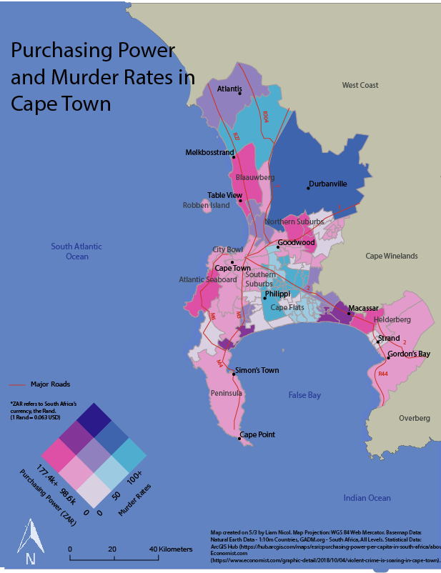
Bivariate Choropleth of Cape Town, South Africa, showing the relationship between purchasing power and murder rates
This map showcases murder rates and purchasing power in Capetown, and where these variables are related, procured in response to the Geog370 Final Lab prompt.
Shades of pink represent areas with the highest purchasing power, and shades of light blue represent areas with the highest murder rates, the darker shades of blue showcase where these two variables are both high, and white represents where both variables are low.
Major roads, bodies of water, neighborhoods, and precincts are labeled.
The inspiration for this map comes from my general interest in crime in urban settings, coupled with my relationship with South Africa. My father grew up in Cape Town, my grandmother lives there, and I visited there a few years ago. While there, I encountered drastic differences across neighborhoods in terms of quality, and subsequently, safety. Because of this experience, I wanted to map the geography of this reality, in order to analyze the areas that are the most volatile, and how this may relate to purchasing power.

Liam Nicol, Geographer at UW-Madison Lnicol2@wisc.edu