Our Geog 778 course is the culmination of our online and in-person master’s curriculum. Students in this class take all the knowledge they’ve gained from our program and fuse it with personal, real-world subject matter. End result? Every 778 student proves that they can conceive and solve real-world programming problems and provide GIS application support independently, and they walk out of the classroom (or home office) with a portfolio piece they can talk about with pride.
On this page, we’re proud to share a selection of 778 projects. The breadth of knowledge on display and the wide variety of topics covered speak to the depth of our program. Enjoy!
Spring 2026
This is an accordion element with a series of buttons that open and close related content panels.
Addison Atkin | Live Snowplow Tracking Dashboard
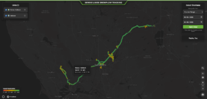
Serene Lakes is a Tahoe neighborhood with minimal cell coverage that averages 35 feet of snow annually, so knowing when your road is plowed is critical. Existing commercial telematic services like Geotab provide basic and expensive solutions, so I built a better, low-cost GPS tracking dashboard from scratch. I used Teltonika FMM230 trackers to send GPS data to a custom Linux VPS via TCP/IP, which then routes to my firebase database. To keep cloud and storage costs near zero, I engineered a dual-database pipeline using Firebase for real-time live map updates and Google BigQuery for cheap historical storage. A self-hosted Valhalla engine snaps raw coordinates to the road network via my api, which is then visualized on a lightweight Mapbox GL JS frontend. The interactive dashboard features live tracking, historical route replays, and a color-coded recency filter (among other features). The result is a highly functional, low-latency tracking application that outperforms leading commercial interfaces and works with general vehicles as well as machinery equipment.
Technology Used: JavaScript, Python, Mapbox GL JS, FastAPI, WebSockets, ArcGIS, Google Firebase Realtime Database, Google BigQuery, Valhalla routing engine, Virtual Private Server, Linux (systemd), Google Authentication
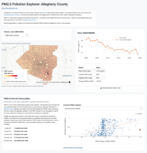
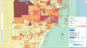
Kevin Crowe | PM2.5 Explorer: A Tract-Level Interactive Visualization Tool for PM2.5 Exposure in Allegheny County, 2001–2024
As the long-term negative health effects of PM2.5 exposure come more into focus, there is a need for geographically granular data and analysis that shows which communities have seen the highest pollution levels over long periods of time. This web application provides annual data for PM2.5 air pollution exposure from 2000 to 2024 aggregated to the Census tract level for Allegheny County using inverse distance weighting interpolation. The tool displays the annual data on a map that allows users to select each year or the 25-year average. Coordinated data visualizations show trends in pollution over time as well as correlations between PM2.5 pollution exposure and variables from the Social Vulnerability Index from the Centers for Disease Control and Prevention. The tool allows for the download of each tract’s annual means for PM2.5 from 2000 to 2024.
Technology Used: R, Shiny, mapgl, ShinyApps.io
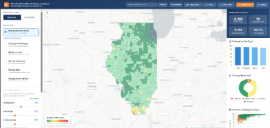
Ethan Kalchik | Illinois Broadband Gap Analysis
The Illinois Broadband Gap Analysis Tool is an interactive web mapping application that identifies and visualizes broadband service gaps across all 3,265 census tracts in Illinois. The tool synthesizes U.S. Census Bureau ACS 5-Year data including internet subscription rates and median household income and poverty rates into a composite Broadband Need Index scored from 0 to 100 per tract. The application provides six choropleth layers including a 2019–2024 longitudinal change view and features real-time filtering and user-adjustable index weights and county-level drill-down and CSV export and a colorblind-safe palette. Built as a single-file web application using Leaflet.js and Chart.js with a Python ETL pipeline for data processing the tool requires no backend infrastructure and is designed for state broadband planners and policymakers and community organizations seeking to prioritize federal broadband funding investments like BEAD.
Technology Used: HTML, JavaScript, Leaflet.js, Chart.js, Python, GeoPandas, Shapely, GeoJSON, OpenStreetMap Nominatim API, GitHub, GitHub Pages
Lindsey Samotis | Pure Michigan? When Fresh Water Faces a Dirty Threat
Water based recreation is an important part of Michigan’s economy. There are over 3,000 water trails and 11,000 inland lakes for fishing, paddling, boating, and swimming in the state. Awareness of PFAS contamination in Michigan waters has grown in recent years. PFAS are man-made chemicals that are harmful to human health.
Michigan has PFAS sample data dating back to 2001 and recreation data for fishing, boating and water trails. Through an interactive web map and narrative StoryMap, this project links these data sources to inform the public about where PFAS concentrations are higher than state recommended limits. Identifying these areas can help the public make safe decisions about where to recreate.
Technology Used: JavaScript, ArcGIS StoryMaps

Sonja Sebree | Advanced Animal Locator
The Advanced Animal Locator Application (AALA) is a mobile-first geospatial system for identifying and analyzing loose, stray, and abandoned animal incidents across South Texas. It integrates historical Austin 311 data with real-time Volunteered Geographic Information (VGI) collected via Survey123, producing a harmonized dataset for spatial analysis. Density surfaces and repeat-location detection reveal clustering patterns and high-risk corridors, particularly along the urban–rural fringe.
The system leverages ArcGIS Online, ArcGIS Pro, and Python-based ETL workflows to ensure schema normalization, data quality, and temporal consistency. Results are delivered through interactive web maps and dashboards supporting field reporting, dispatch prioritization, and strategic planning.
By transforming fragmented reporting into a structured geospatial framework, AALA enhances situational awareness and enables data-driven decision-making for public safety and animal welfare.
Technology Used: ArcGIS Survey123, ArcGIS Survey123Connect, ArcGIS Pro, ArcGIS MapViewer, ArcGIS Dashboard, Javascript, Python, Pandas, Github, Visual Studio Code, PostGres, ERD Diagrammer
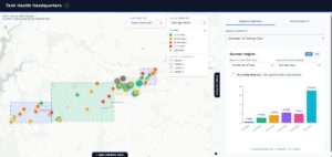
Justin Sena | Tank Health Headquarters: Integrating Intelligent Document Processing and Web GIS for Water Infrastructure Management
Water utility asset management relies heavily on non-standardized contractor inspection reports, creating a massive data interpretation burden for engineers. This practicum project addresses this challenge by developing a decoupled web GIS application that transforms unstructured reports into actionable spatial intelligence. Built using React.js, MapLibre GL JS, and a Python Flask backend, the application integrates Google’s Gemini Large Language Model to perform Intelligent Document Processing (IDP). The system autonomously extracts critical engineering parameters and rehabilitation cost estimates from uploaded documents. To ensure enterprise data integrity, the architecture enforces a Human-in-the-Loop (HITL) validation workflow, requiring professional engineering oversight before committing AI-extracted data to the permanent GeoJSON spatial database. By providing dynamic cartographic and statistical dashboards, this tool empowers engineers and planners to efficiently visualize infrastructure vulnerability and justify targeted capital rehabilitation investments.
Technology Used: React, MapLibre GL JS, Recharts, Python Flask, Google Gemini API, GeoJSON, Vite
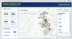
Henry Stepanus | NOVEC (Northern Virginia Electric Cooperative) Predictive Grid App
The NOVEC Predictive Grid is a web-based geospatial dashboard designed to support electric utility planning by visualizing spatial patterns of clean energy adoption. This project integrates solar installations, electric vehicle (EV) accounts, and charging infrastructure within the Northern Virginia Electric Cooperative (NOVEC) service area. Using PostgreSQL/PostGIS for spatial analysis and Leaflet for web visualization, the application generates grid-based density surfaces, hotspot analysis, and Local Indicators of Spatial Association (LISA) clusters to identify statistically significant patterns. The tool enables planners, engineers, and business teams to detect adoption clusters, infrastructure gaps, and emerging demand zones. By transforming complex spatial datasets into an interactive and intuitive interface, the NOVEC Predictive Grid enhances data-driven decision-making and provides a scalable foundation for future predictive modeling and grid planning applications.
Technology Used: Leaflet, Python, JavaSript, PostGIS, PgAdmin
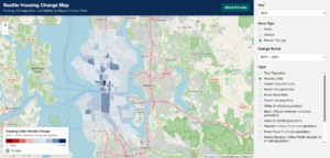
Callum Wilson | Seattle Housing Change Map: Housing, Mobility, and Demographic Change
This project presents an interactive web map that brings together housing, demographic, and selected mobility data for Seattle, using merged census tracts as a consistent geography for comparison over the decade from 2014 to 2024. The idea of this project was to create a tool that allows users to compare this data across the city and over time in one place, without having to navigate through various census tables for different topics and years. With this web map, users can switch between years, view totals, change, or percent change, and explore topics such as population, rent, occupancy, vacancy, race and ethnicity, and residential mobility. A major part of the project involved cleaning and standardizing American Community Survey 5-Year Estimate tables in Python, aggregating tract units with boundary changes into merged census tracts, joining the processed tables to tract geometry in ArcGIS Pro, and building the final web map in Leaflet with HTML, CSS, and JavaScript.
Technology Used: Leaflet, ArcGIS, Python, JavaScript, HTML, CSS
Fall 2025
This is an accordion element with a series of buttons that open and close related content panels.
Daniel Arnouk | WROC Project Tracker: Mapping 15 Years of Wisconsin Aerial Imagery Projects
The Wisconsin Regional Orthoimagery Consortium (WROC) in conjunction with Ayres Associates has coordinated aerial imagery and elevation data acquisition across Wisconsin counties for over two decades. As the project portfolio grew, project managers faced increasing difficulty locating historical project information scattered across spreadsheets, file directories, and institutional knowledge. This project developed a web-based mapping application to consolidate 15 years of orthoimagery and lidar project data into a single interactive geographic interface. Built with HTML, CSS, and vanilla JavaScript using the Leaflet mapping library, the application enables users to filter projects by type, year cycle, pixel resolution, and quality level. County polygons display project history on click, and export functionality generates print-ready maps in PDF, PNG, and JPG formats. The tool reduces time spent searching for historical data while improving consistency in client responses and project planning.
Technology Used: HTML, CSS, JavaScript, Leaflet
![]()
Leah Bates | Exploring Sea Level Rise with Interactive Mapping: Case Study of Miami, FL
This project presents an interactive web-mapping application designed to visualize projected sea level rise in Miami-Dade County while integrating demographic and socioeconomic vulnerability data. By combining NOAA sea level rise scenarios with U.S. Census indicators, the tool enables users to explore not only where flooding is expected to occur, but who is most at risk and why. Built using Leaflet.js, Turf.js, and D3.js, the application supports scenario-based inundation mapping, tract-level demographic exploration, and custom polygon analysis for neighborhood-scale assessments. The tool is intended for community organizations, policymakers, and residents seeking accessible, equity-focused insights on climate risk. By connecting environmental projections with social vulnerability, this application highlights disparities in climate impacts and supports more informed, just, and resilient planning across the city of Miami, Fl.
Technology Used: Leaflet, D3.js, Turf.js, JavaScript, ArcGIS, QGIS, Python
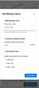
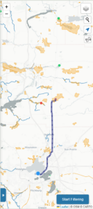
Yu Fan | Trout Navigation App
The app addresses the fragmentation of critical recreational and environmental data in Wisconsin’s ecosystem. Currently, information regarding trout fishing, water quality and land management is scattered, creating challenges for both anglers and conservation planners. This project delivers a centralized, mobile-first web map built on a modern geospatial stack featuring Vue.js, Express.js and PostgreSQL/PostGIS. By integrating Wisconsin DNR Open Data such as Trout Streams quality, Public Boat Access Sites, Impaired Lakes etc., the application allows users to filter for high-quality habitats and generate navigation routes to access points. Utilizing Tileserver for vector tile distribution, the system ensures efficient rendering of complex spatial data. Ultimately, this tool bridges the gap between raw data and practical decision-making for outdoor recreation and conservation management.
Technology Used: Leaflet, Tileserver, Vue.js
Link: https://staging.d35qdrt1qinwxu.amplifyapp.com/
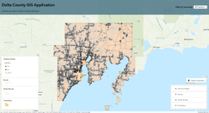
Rawan Hinzman | Delta County GIS Application
Delta County, Michigan, with a population of 36,687, has faced persistent challenges in maintaining accurate 911 address data essential for emergency response. Road name changes, parcel splits, and combinations have created inconsistencies that delay first responders and highlight the need for a county-managed GIS solution.
This project introduces a web-based GIS application designed to streamline address verification. Developed with HTML and Esri web maps, and hosted on ArcGIS Online, the system balances accessibility with data security by using public view-only layers for visualization and restricted editing tools for county staff. Employees can classify address points as correct, incorrect, or misplaced, with problematic points flagged for field inspection through Esri Field Maps.
By enabling township-based filtering and systematic workflows, the application reduces reliance on external consultants and ensures data integrity. Its modular design provides a scalable framework for broader GIS tasks, strengthening Delta County’s capacity to maintain accurate spatial data critical to public safety.
Technology Used: JavaScript, HTML, CSS, Esri web maps, and ArcGIS Online
Link: https://rhinzman.github.io/Delta-County/
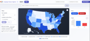
David A. Kimmel | Campaign Finance Explorer
The Campaign Finance Explorer is a full-stack web application that transforms Federal Election Commission (FEC) data into interactive geographic visualizations, making campaign finance patterns accessible to researchers, journalists, and citizens. Built with Node.js, Express, D3.js, and Chart.js, the application provides three analytical views: individual candidate exploration with state-by-state choropleth maps, side-by-side candidate comparison, and aggregate party fundraising analysis. The system employs intelligent API optimization through Bottleneck rate limiting and LRU caching to efficiently manage the FEC’s 1,000 requests/hour quota while maintaining responsive performance. Key features include quantile-classified choropleth maps with party-specific color schemes, financial breakdown charts, and publication-ready PNG export functionality. The application addresses critical gaps in campaign finance accessibility by eliminating the need for technical expertise or complex database queries, enabling users to understand where political contributions originate geographically. This tool promotes transparency and accountability in democratic governance by democratizing access to public campaign finance data spanning 2000-2024 election cycles.
Technology Used: JavaScript, with Node.js, Express, D3.js, and Chart.js
Link: https://campaign-finance-explorer.onrender.com/
Zhan Shi | FireScope: AI-Powered Wildfire Forecasting for Emergency Response
This project leverages advanced AI techniques to predict wildfire occurrences and their potential spread. By analyzing historical wildfire data, weather patterns, and vegetation types, the model provides accurate forecasts that can aid in early warning systems and resource allocation for firefighting efforts. The integration of geospatial data enhances the model’s precision, making it a valuable tool for mitigating the devastating impacts of wildfires.
Technology Used: Python, JavaScript, Leaflet, Git, QGIS
Link: https://shijimmy.github.io/FireScope/index.html
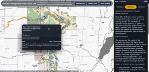
Lisa Siewert | Educator Geologic Map of the Ice Age Trail
This project began with a simple question. How can teachers help fourth graders understand the incredible glacial landscapes they walk through on the Ice Age Trail? The Educator Geologic Map of the Ice Age Trail grew from that question and was designed to give teachers a clear and engaging way to explore the geology of Lincoln, Langlade, Marathon, and Portage Counties before stepping outside with their students.
When a teacher clicks a trail segment, the map tells the story of that place. The Overview tab explains what makes the land special in language that feels friendly and age appropriate. The Geologic Concepts tab highlights the features that shaped that segment, like kettles, moraines, or bedrock ridges, and connects them to the larger glacial history of Wisconsin. The Activities tab offers practical ideas teachers can use to help students make sense of the landscape, whether they are in the classroom or standing on the trail.
The application brings together state geologic datasets, custom symbology, and curated descriptions from the book Geology of the Ice Age Trail. It was built with ArcGIS Pro, ArcGIS Online, and custom HTML, CSS, and JavaScript to create a clean and intuitive experience.
The project is meant to help teachers feel confident when teaching geology and to give students a richer connection to the places they explore. If a fourth grader can look at a hill or a kettle and understand the story behind it, then the map has done its job.
Technology Used: ArcGIS Pro, ArcGIS Online, ArcGIS Maps SDK for JavaScript (4.29), HTML, CSS, JavaScript, Custom JSON data structures for segment content, GitHub
Link: https://youtu.be/N3z0O6VN5es
Ethan Westerkamp | Michigan State Park Vegetation Application
The Michigan State Park Vegetation Application is an interactive website designed to allow a user to discover possible plant species existing in Michigan’s state parks. The potential species are estimated by the natural community types intersecting the park boundaries, these spatial relationships access a related table of species which is displayed for the user alongside descriptions and images. The database is structured to allow the user to query the species existing within parks and the parks which contain a selected species. These website functions are carried out with feature services on ArcGIS Online and the ArcGIS Maps SDK for JavaScript and displayed with HTML, CSS and ESRI’s Calcite components.
Technology Used: ArcGIS Online, JavaScript, HTML, CSS
Link: https://youtu.be/prp2CLzuXCE
Summer 2025
This is an accordion element with a series of buttons that open and close related content panels.
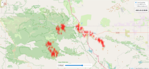
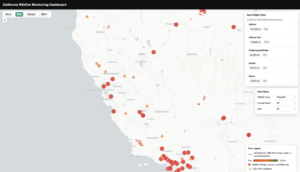
Xun Gong | California Wildfire Monitoring Platform
The California Wildfire Monitoring Platform is a web-based dashboard providing real-time situational awareness for California. It unifies authoritative perimeters (WFIGS/CAL FIRE), satellite hotspots (FIRMS), HRRR winds, PurpleAir smoke, and Landsat NDVI. Fire mode colors perimeters by containment%, ranks the Top-5 incidents by uncontrolled area, filters by time/size, and approximates 7-day spread from FIRMS. Wind mode renders a particle advection field from HRRR u/v (latest JSON from GCS). Smoke mode maps PurpleAir sensors with an AQI legend and rich popups via a proxy. NDVI mode shows dated mosaics and a compact time series for pre/post-fire change. A Python/GEE pipeline with GitHub Actions automates daily ingestion and conversion. Clear cartography, scale-dependent rendering, and tailored popups/legends keep the interface fast and readable for the public, students, and planners.
Technology Used: Leaflet, Python, JavaScript, ArcGIS Online
Link: https://xxenia1.github.io/wildfire-Monitor/
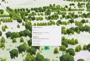
Eric Johnson | Richmond Tree Tracker
The Richmond Tree Tracker provides a visually-rich, real-time toolset about the City of Richmond’s trees and potential tree sites for use by three primary audiences. Members of Richmond Tree Stewards, volunteers who help the city care for its trees, can use its mobile app to update in real time data about individual trees and potential sites for trees, including location, condition, species, and more. The general public can use it to find information about specific trees in their neighborhood and to get a sense of the tree canopy in the city. The staff of the City’s Urban Forestry Division access a dashboard offering a comprehensive, live overview of the trees in the city, with important metrics visualized for ease of understanding and use in planning.
Technology Used: ArcGIS Online, Experience Builder, Map Viewer, Scene Viewer, Field Maps Designer, and Dashboards
Sophie Michalski | Arctic Tern Migration
The Arctic tern story is an interactive, scroll-driven web story that illustrates the extraordinary pole-to-pole migration of the Arctic tern, the longest known animal migration on Earth. Designed with a combination of Leaflet, Mapbox GL JS, and other JavaScript libraries, the project integrates maps, graphics, and text to highlight key features throughout the tern’s journey. The visualization not only showcases the bird’s remarkable endurance and ability but also contextualizes its role within the global ecosystem and climate. By blending cartographic design with engaging programming, the project demonstrates how spatial storytelling can make complex environmental phenomena more accessible to a broad audience. Intended for students, researchers, conservationists, and the general public, this story serves as both an educational resource and a communication tool to highlight the value of GIS in environmental awareness.
Technology Used: Leaflet, Mapbox GL JS, JavaScript, Adobe Photoshop, QGIS
Link: https://smichalski3.github.io/_778-final-project/

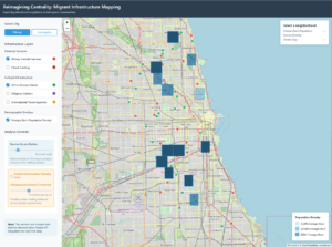
Ephraim Retta | Reimagining Centrality: Migrant Infrastructure Mapping
This project presents Reimagining Centrality: Migrant Infrastructure Mapping, an interactive web-based application designed to visualize and analyze infrastructure patterns in immigrant communities. Grounded in the theoretical framework of Central Place Theory and informed by concepts from Splintering Urbanism (Graham & Marvin, 2001), the tool highlights how migrant-serving infrastructure—such as money transfer services, ethnic grocery stores, and religious centers—shapes accessibility and centrality in urban neighborhoods. Using scraped Google Maps data and available census information, the application provides a layered mapping environment with customizable analysis controls for service density and demographic overlays. The tool demonstrates the potential for expansion across cities and infrastructure categories, offering a flexible platform for exploring the socio-spatial dynamics of migrant communities.
Technology Used: Leaflet, JavaScript
Spring 2025
This is an accordion element with a series of buttons that open and close related content panels.
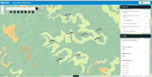
Maya Edstrom | Renewables Project Map
This capstone project addresses a need had by project managers working in an environmental engineering and consulting company on geotechnical engineering reports in the renewable energy sector (wind and solar). They needed a one-stop-shop to review locations of all past geotechnical borings and testing completed across North America as well as structures (such as wind turbines) constructed overlaid with relevant data (geologic data, seismic data, flood data, soils data, etc.) to simplify their review process. This was accomplished through the creation of a Python script using ArcPy that can loop through this company’s GIS drive, appending all identified relevant information into a new geodatabase that was then used for the primary dataset in the web application.
Technology Used: Python, ArcGIS Pro, ArcGIS Online (Experience Builder)
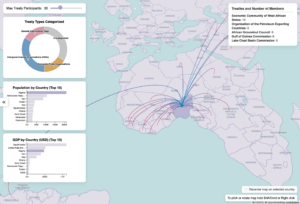
Morgan Grundy | TreatyGraph
This project presents an interactive, web-based visualization of international treaty networks, focusing on economic, security, and environmental agreements. Utilizing data sourced from Wikidata through SPARQL queries, the application maps shared treaty memberships between countries, enabling users to explore patterns of regional versus global cooperation. The visualization integrates Deck.gl for rendering dynamic arcs between member states and D3.js to display circular bar charts summarizing treaty categories by country. Designed with policymakers, researchers, and NGOs in mind, the tool aims to facilitate analysis of geopolitical alignment and strategic partnerships. The project contributes to the field of geospatial visualization and analytics by combining semantic web technologies with advanced web cartography techniques to reveal complex, multilayered diplomatic relationships.
Technology Used: Deck.gl, Python, Javascript, D3, QGIS, Wikidata
Link: https://sojourner1066.github.io/TreatyGraph/
Lindsay McClintock | Wisconsin Technical Colleges Explorer
The Wisconsin Technical Colleges Explorer is a web map that highlights the 16 colleges belonging to the Wisconsin Technical College System. Prospective post-secondary students are able to use one website to explore basic information about the 16 colleges, the associate degree programs they offer, and their surrounding communities. Users can find enrollment numbers, college-sponsored housing, and wellness offerings at each college. The surrounding communities provide information on population, rent, and age demographics. The web map was designed for use on mobile devices to better reach the primary audience. Information on colleges can be overwhelming, the Wisconsin Technical Colleges Explorer provides a simple, user-friendly tool to begin discovering the opportunities that await.
Technology Used: ArcGIS SDK for JavaScript

Katherine Soltys | Wildlife-Vehicle Collision Hotspots in Wisconsin
Wisconsin is fifth in the country for wildlife-vehicle collisions, according to State Farm insurance company. These collisions are expensive for both drivers and insurance companies. This report looks at spatial data for wildlife collisions across the state, provided by the Wisconsin Department of Transportation, breaks them down by various factors and identifies hot and cold spots, then attempts to answer why some areas are hot spots for collisions and other areas are not by looking at various possible covariants.
Technology Used: ArcGIS, QGIS, Adobe Illustrator and InDesign
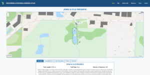
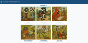
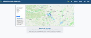
Joseph Willman | Wisconsin Accessible Birding Atlas
The Wisconsin Accessible Birding Atlas is designed to break down barriers and make birding an inclusive, enjoyable activity for individuals of all abilities and experience levels. This interactive mapping resource highlights birding hotspots around Madison, with detailed accessibility information to ensure that everyone can engage with the outdoors. The atlas features a central map where users can explore sites and filter locations based on accessibility needs such as parking, restrooms, and public transportation. Each site has a dedicated page offering a comprehensive description, accessibility features, recent bird observations, and more. Additionally, the atlas includes a curated resource library offering birding tips, community group connections, and opportunities to participate in bird conservation efforts.
Technology Used: Leaflet, Python, Javascript, ArcGIS Pro, CSS, Html, Bootstrap
Link: https://joeywillman.github.io/WisconsinAccessibleBirdingAtlas/index.html
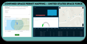
Karen Witsell | Confined Space Permit Mapping - United States Space Force
Confined spaces, essential yet inherently hazardous components of our built infrastructure, demand stringent safety protocols for worker entry during construction and maintenance. Identified by specific criteria encompassing size and environmental hazards, these spaces often necessitate permits and specialized equipment to mitigate significant health risks. This project establishes a geospatial workflow to map the location and characteristics of confined spaces, incorporating air sampling results to identify permit-required locations definitively. The goal is to enhance worker safety, prevent information loss, and provide accessible, categorical information to stakeholders, including Air Force civil engineering, safety officers, firefighters, and maintenance personnel. Leveraging field collection information, connected to an intuitive dashboard, ensures critical risk information is readily available to those who need it most. A key outcome of this project is the increased focus on worker safety through establishing a repeatable mapping project.
Technology Used: ArcGIS
Fall 2024
This is an accordion element with a series of buttons that open and close related content panels.
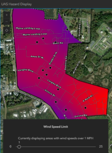
David Babson | UAS Hazard Display
Rapid improvements in Unmanned Aerial Systems have led to increased demand for package delivery and public transport. Urban Air Mobility initiatives are not permitted due to strict FAA regulations. NASA is interested in implementing GIS Enterprise products to improve safety metrics for drone flight in hopes to meet the FAA regulations. Several GIS server types have been hosted, alongside geoprocessing files, to locate hazard areas in flight zones. This involves streaming ground sensor data and producing near real-time interpolations of wind speeds. Raster data is then converted into polygons identifying areas containing dangerous wind speeds. These hazard areas are displayed on the UAS Hazard Display web application, as well as passed off to the automated pathing systems to safely reroute the flight plan.
Technology Used: ArcGIS Enterprise System, GeoEvent Server, ArcPy, ArcGIS Javascript SDK
Andrew Sirota | Animal Sightings in Glacier National Park
During a visit to Glacier National Park, I observed several different species of wildlife including my first Grizzly Bear sighting. This inspired me to create an application that allows users to track their animal encounters in the park by placing a point on the map, completing a drop down, and adding a photo. If users have difficulty identifying species they come across, they can use an animal information button in the application to access more information. I used the ESRI ArcGIS Maps SDK for JavaScript with GitHub as a repository. The database in ArcGIS Online stores the points and photos that the users upload.
Technology Used: ESRI ArcGIS Maps SDK, JavaScript, GitHub

Summer 2024
This is an accordion element with a series of buttons that open and close related content panels.
Jimmy Alani | GIS Based Tool for Mapping and Documenting Customary Land in Uganda
In Uganda, where over 80% of land is held under customary tenure but often lacks formal documentation, this project introduces a GIS-based tool in the form of a QGIS plugin to address these challenges. Leveraging open-source technologies like QGIS, PostGIS, and Python, the plugin provides a robust platform for mapping, editing, and managing customary land parcels. Key features include digitizing tools, parcel management, checking for inconsistencies or topological constraints, applicant details input, shapefile import, and reporting functionalities. These capabilities aim to enhance land tenure security by supporting the legal recognition of customary lands through accurate and accessible documentation. The tool is designed for use by land surveyors and records officers, enabling them to efficiently update and maintain land records. Future work will explore mobile integration and expanded geographic coverage to further strengthen land management practices across Uganda.
Technology Used: Python, java, JavaScript, QGIS, Postgres
Zhiyi Li | Public GIS Interactive Tool for 911 Data Query
This project develops a web-based interactive tool that provides public access to 911 data in the City of Madison from the Madison Police Department website. This significantly reduces inquiry calls and allows emergency services to focus more on urgent matters. Spearheaded by the Madison Police Department and utilizing advanced GIS technologies, this platform allows residents, researchers, and policymakers to directly query and analyze 911 data. By integrating Experience Builder and ArcGIS Online, the tool offers a dynamic and user-friendly interface that enhances transparency and efficiency in public safety operations. Key features include interactive maps, detailed filtering options, and targeted search functionalities for specific types of 911 calls, all fostering an environment where community members can actively engage with and utilize vital emergency data. This initiative not only streamlines data access, thereby reducing the workload on city staff, but also sets a new standard in public safety and community interaction.
Technology Used: ESRI Experience Builder, ESRI ArcGIS Online
Links: https://arcg.is/1WmSjz1
Spring 2024
This is an accordion element with a series of buttons that open and close related content panels.
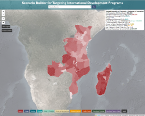
Kyle Alden | Scenario Builder for Targeting International Development Programs
The Scenario Builder for Targeting International Development Programs aims to ensure that international development practitioners have easy access to the evidence that they need to make and defend decisions about where they target their programs. The tool has two main features. First, users can explore recent subnational data across ten countries for ten well-being and opportunity indicators—for example, the prevalence of poverty, hunger, malnutrition, and proximity to cities. Second, they can create scenarios where they would plan to implement a development program aimed at improving the livelihoods of the population in that area. They would do this by selecting administrative areas and then running an analysis that provides summary statistics across those areas. The outputs can be easily exported to a pdf and include the summary stats, maps, and extensive sourcing for future use.
Technology Used: JavaScript, Node.js, React, React-Leaflet, PostgreSQL, ArcGIS
Link: https://fast-anchorage-80376-8619ba4181a4.herokuapp.com/
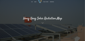
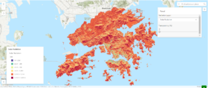
Jusphonia Ho | Hong Kong Solar Radiation Map
Hong Kong is a city with abundant sunlight for considering solar energy as the energy source. Yet, only a small portion of solar energy is now transferred from sunlight. My project is to perform solar radiation analysis and create a web application to visualize the distribution of solar radiation over Hong Kong territory to support users in planning for locations to place the solar photovoltaic (PV) panels to generate cleaner renewable energy from solar.
The Feed-in Tariff scheme introduced by the government proposed an electricity bill reduction program for citizens who installed PV panels in their properties through selling the energy generated from the panels to the electricity companies. My project hopes to help the property owners in considering contributing their properties to solar energy generation.
Technology Used: ArcGIS Pro, Javascript, ArcGIS Maps SDK for JavaScript, jQuery UI, Bootstrap, HTML, CSS, Esri Calcite Design
Link: https://github.com/jusphonia1224/GEOG778
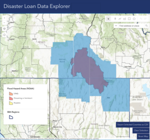
Vicky Johnson-Dahl | Disaster Loan Data Explorer
The Disaster Loan Data Explorer was designed for the US Small Business Administration’s Office of Disaster Recovery and Resilience as a tool to explore nearly 20 years of disaster lending history—over 2.5 million database entries—in geospatial format aggregated up to the county (or county-equivalent) level. Users can select counties by intersection with a disaster or by a specific indicator via SQL query and export their selection as a csv file with 20+ columns of relevant data (demographics, household income, commonly spoken non-English languages, etc). With a clean, user-friendly interface that seamlessly combines this disaster lending history with live disaster feeds, this app will save ODR&R a lot of time in the thick of disaster response, when every minute counts!
Technology Used: ArcGIS Pro, ArcGIS Javascript SDK, CSS, HTML
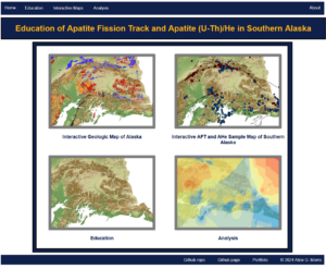
Alice Morris | Education of Apatite Fission Track and Apatite (U-Th)/He in Southern Alaska
An educational platform and tool for geologists to learn and understand the basics of low temperature thermochronology, such as apatite fission track (AFT) and apatite (U-Th)/He (AHe), and their relation to the geology of southern Alaska. This is accomplished by the use of five distinct pages: a home page; an education section to learn about the basics of thermochronology, the differences between AFT and AHe, and an introduction to southern Alaska; an interactive geologic map of Alaska featuring the full geology of the state, the basement units, and Quaternary faults; an interactive sample map to show spatial locations of collect AFT and AHe samples; and an analysis section to look at data distribution and areas of missing data.
Technology Used: Leaftlet, Python, Javascript, ArcPy, HTML, CSS, ArcGIS, ESRI JS API, Bootstrap, Leaflet Fullscreen, D3
Link: https://alicegmorris.github.io/GEOG778-Project/
Jack Plasterer | Mapping Jet Noise: Illuminating the Impact of Sound on Madison, WI
This project seeks to visualize jet activity in the Madison, Wisconsin airspace in the form of noise events using ArcGIS Online Story Map capabilities. We are trying to measure the impact of noise put out by military jets and other aircraft on Madison’s quality of life, particularly since the F-35s arrived in May of 2023.
Technology Used: ArcGIS Pro, ArcGIS Online, ArcGIS Story Maps and JavaScript (for beta testing purposes)
Link: https://storymaps.arcgis.com/stories/0201d603937b47d09d97da12fb3c89fe
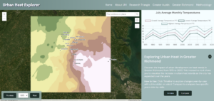
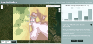
Julianne Smiecinski | Urban Heat Explorer
Urban Heat Islands (UHIs) significantly impact medium-sized metropolitan areas, which are often overlooked compared to larger cities. To address this, the Urban Heat Explorer was developed, focusing on metropolitan areas such as the Research Triangle, Greater Austin, and Greater Richmond. The application was developed using Python scripts for data and geoprocessing, and JavaScript to create an interactive user interface with the ArcGIS for JavaScript API and Chart.js. This application visualizes average temperature data from 1975 to 2020, highlighting changes every five years in July. It features a Time View for year-by-year examination of the data and a Compare View with a swipe function for comparing years. Each view is paired with dynamic and interactive graphs created with Chart.js to further visualize the data. Designed for urban planners and policymakers, this tool supports informed decision-making by illustrating temperature variations due to urbanization, thus aiding sustainable urban development strategies.
Technology Used: Python, JavaScript, ArcGIS Pro, ArcGIS for JavaScript API, Chart.js
Link: https://juliannesay.github.io/urbanHeat/index.html
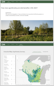
Jessica Steslow | Environmental Benefits of Agroforestry in Wisconsin
My project is a website to explore the environmental benefits of agroforestry, the intentional integration of trees and shrubs into crop and animal farming systems to create environmental, economic, and social benefits. I worked with the Savanna Institute, a nonprofit that researches, promotes, and assists in the implementation of agroforestry, to guide my data analysis on this project. I used raster manipulation and spatial analysis tools to compare Savanna Institute data on suitability of chestnut trees in Wisconsin against existing agricultural land, soil susceptible to wind or water erosions, and the Wisconsin DNR’s summary metric of Ecological Index per watershed. My website is a guided exploration that defines agroforestry, discusses my data sources and analysis, and presents the data in 3 interactive maps. I used ESRI’s Experience Builder, taking advantage of built-in widgets to display ESRI ArcGIS Online Web Maps that I prepared with my agroforestry analysis.
Technology Used: ESRI ArcGIS Pro for raster manipulation and data analysis, ESRI ArcGIS Online for data hosting and map making, ESRI Experience Builder to create the website
Links:
https://www.youtube.com/watch?v=yn5mo7OvPQg
https://experience.arcgis.com/experience/0feb9842864540189ec13144deff7652/
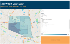
Natalie Young | Demographic & Housing Changes in Edgewood, WA, 2010-2020: A Python Script Collection & Tableau Map Visualization
Edgewood, Washington is a city of about 13,500 people which has grown rapidly in recent years as its single-family-dominant housing composition has changed to include large apartment complexes. This project compiles, analyzes, and shares decennial census data for the Edgewood area using Python scripts and a Tableau map visualization, allowing detailed exploration of changes in the area. Data subjects include housing units, vacancy, tenure, total population, and populations by race and ethnicity. The Python scripts compute the 2010-2020 changes in each topic for the area’s block groups and census tracts. Due to boundary changes across the decade, the 2010 census data needed for comparison to 2020 data were aggregated from 2010 census block data. The ArcPy mapping library is used extensively in the script. The interactive Tableau visualization includes tract and block group level maps that can be adjusted to any data topic, to display 2010, 2020, or decadal change.
Technology Used: Python, ArcGIS, Tableau
Fall 2023
This is an accordion element with a series of buttons that open and close related content panels.
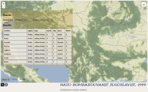
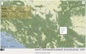
Jianjin Chen | NATO Bombardovanje Jugoslavije (Operation Allied Force)
The focus of my project centers on the air operations during the Kosovo War, utilizing a database to document NATO air strikes during Operation Allied Force and visualizing it through interactive map. The product is intended to create an iteration of existing static maps of same topic since it exceeds inherent limitation of static maps through its interactive format. Audiences can easily locate the information they need through date selector or query panel. The structure of this project is based on two primary components. A backend PostgreSQL database and a frontend interactive map.
Important Note: To create this object, the fundamental raw-data are collected from Milos Popovic’s open source GitHub repository.
Technology Used: Leaflet, Node.js, JavaScript, PostgreSQL
Links:
Github Repository: https://github.com/Chen2023-UW/KosovoProject
Demo: https://drive.google.com/file/d/1ZlbjUV_seH0GMnVty_eBNOhEYFiR5od1/view?usp=share_link
Garrett Fuelling | Olympia WA Master Transportation Plan Storymap
Founded in 1859, Olympia Washington is the capital of Washington State and located on the south end of the Puget Sound. The city is a regional economic hub, with many state government offices, medical facilities, and other sources of regional employment. Olympia’s current population is about 54,000 people and is expected to grow by about 18,000 by 2040.
In 2018, the City began creating the first ever Transportation Master Plan (TMP). The TMP is designed to allow for people to see what the city has planned. This project is a condensed version of the Master Plan, emphasizing the 20 year projects that the city is planning and allowing citizens to explore the data in a dynamic way.
Technology Used: ArcGIS, Storymaps, ArcGIS Online
Link: https://storymaps.arcgis.com/stories/a26bf344d6d942769e9e3efaf553de44

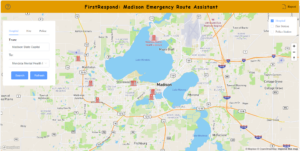
Dong Gai | Optimizing and Evaluating Madison Emergency Response Efficiency
Given the surge in population and traffic in Madison, Wisconsin, it is inevitable that departments will become less efficient in their emergency response. Evaluating and optimizing the efficiency of Madison’s emergency response was the main goal of our project.
In this project, the FirstRespond application uses JavaScript, HTML, CSS, and the MapBox API to build navigation maps that facilitate quick navigation to critical services such as hospitals and police stations during emergencies. It incorporates real-time traffic data to dynamically adjust travel routes and mitigate the impact of traffic congestion on response times. In addition, I found by analyzing the emergency response efficiency using Python that traffic conditions have an 8% negative impact on emergency response efficiency. This project represents a major technological advancement in addressing the challenges posed to emergency services by urban growth and is designed to significantly reduce response times and enhance public safety in Madison.
Technology Used: Python, NetworkX, OSMnx, JavaScript, HTML, CSS, Vue.js, Element UI
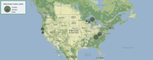
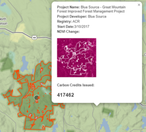
Zac Pinard | Interactive Forest Carbon Offsets Web Map
Forest carbon offsets are projects that protect trees and allow them to sequester carbon from the atmosphere. The amount of carbon they are sequestering correlates to the biomass of the trees in the project. This can be approximated using a proxy called NDVI (Normalized Difference Vegetation Index), which estimates the amount of biomass in an area and can be extracted from satellite images. This interactive web map creates a visual database of forest carbon offset projects. Users can see where the forest carbon offset projects are located using symbols proportional to the number of carbon credits they received. Users can click on these symbols and review a popup window displaying important information about the project such as the name, developer, registry, and most importantly, the NDVI change over time determining if the area appears to be gaining or losing carbon.
Technology Used: Leaflet, Python, JavaScript
Link: https://zacpinard.github.io/Carbon-Offsets/
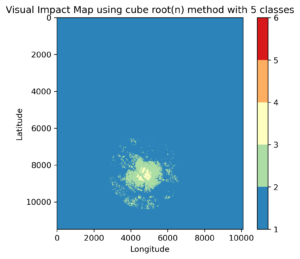
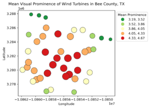
Chinna Subbaraya Siddharth Ramavajjala | Future of Wind Turbines and Viewsheds: A Quantitative Approach
Visual Impact Assessment (VIA) is an essential analysis conducted during the permitting process for constructing onshore wind turbines. Conventional VIA involves calculating a project’s visual impact by considering cumulative viewsheds of blade end and hub heights of wind turbine locations. However, VIA is a geospatial analysis incorporating distance zone effect and visual exposure analytics to comprehensively assess the project’s visual impact. Furthermore, to perform VIA, most visibility analyses rely on commercial software as open-source alternatives are limited. To bridge the gap between enthusiasts and availability, the project aims to create the Python package – viawind. This package offers various functions and abilities to run the complete geospatial pipeline for performing VIA using open-source geospatial libraries.
Technology Used: Python
Link: https://youtu.be/GHYaXMWkQuY
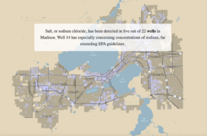
Randi Selvey | Protecting Madison's Freshwater
Madison is surrounded by an important dwindling natural resource that many residents know little about—freshwater. This scroll map is intended to be used as an educational tool for residents of Madison to better understand freshwater as a resource, and learn more about salt’s effect on Madison’s lakes and wells. My goal is to motivate Madison residents to be aware of the effect of winter salt and prevent its widespread use. The project is designed to be a simple interface on any browser and system available for screen viewing on both desktop and mobile. The product was created using HTML/CSS and Javascript to make static maps (created using ArcGIS and Illustrator) interactive.
Technology Used: ArcGIS, Adobe Illustrator, JavaScript, Leaflet, Datawrapper
Link: https://github.com/randimaes/778Final
Spring 2023
This is an accordion element with a series of buttons that open and close related content panels.
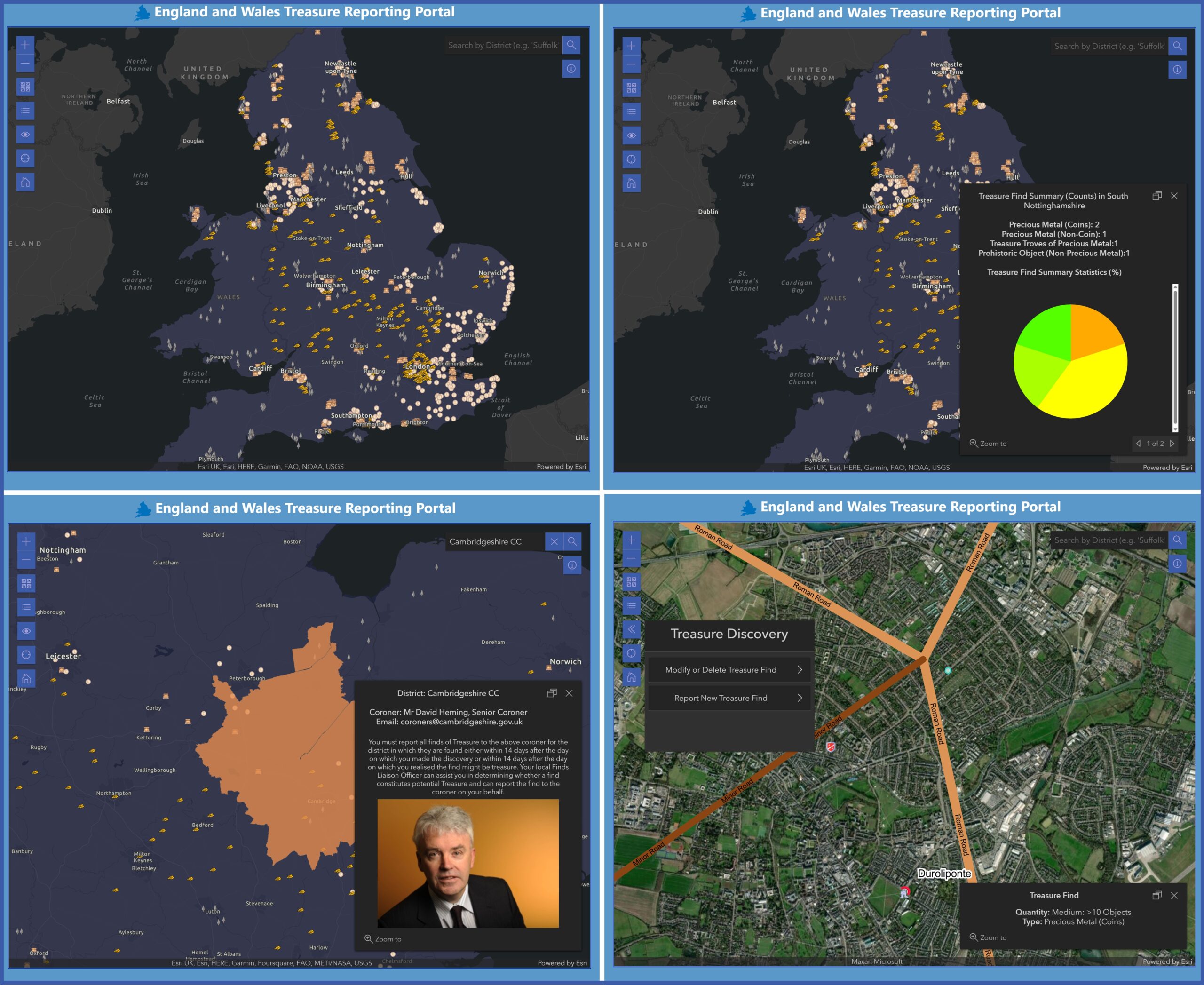
Michael A. Adduci | Participatory Treasure Reporting Web Application in England and Wales
The Participatory Treasure Reporting Web Application in England and Wales is an ArcGIS JavaScript API application. One of the central uses for a treasure-mapping application is its ability to identify locations according to legal criteria, establish historical location situational awareness, and identify the local coroner legally responsible for documenting treasure discoveries in each District by consolidating contact-information and reporting-features into a single web portal.
This study focuses on the development of a treasure-mapping application that addresses the needs of treasure hobbyists and district-level coroners alike. The application enables users to map treasure by type and quantity, and consequently, afford district Coroners the ability to analyze and perform administrative data-curation within the ArcGIS Online environment.
Testing involved producing end-user interaction processes, assessing peer-reviewed feedback on the application’s features, and implementing changes. This study consolidates the disparate process of contacting a coroner and reporting treasure finds into a single intuitive web application.
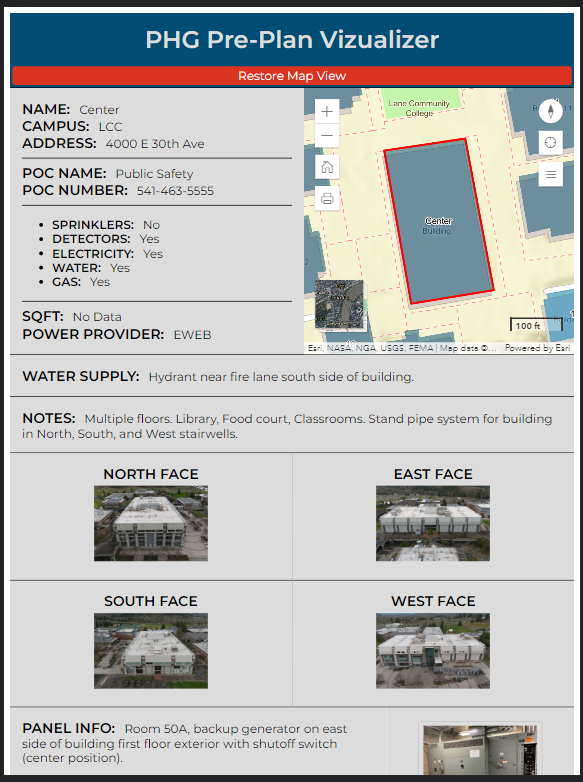
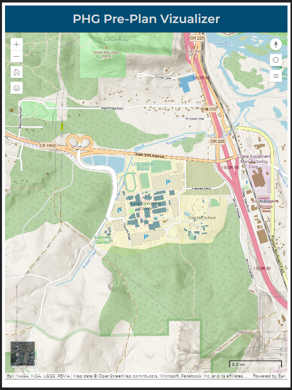
Trever Bruhn | Fire Pre-plan Collector/Visualizer
Fire departments are exploring technologies to improve the collection and use of pre-plans. Pre-plans are an excellent opportunity for mobile geospatial technologies. The ability to serve interactive data and imagery from an interactive web-map is an large advantage over the static pre-plan documents widely used.
This project is a web-based pre-plan application that allows firefighters to view, add, and edit data in a common interface during collection and use in an incident. The application enables data collection with minimal training, makes collected data immediately available in the pre-plan format, and connects images with their associated attributes. Users can explore the surrounding context of a facility, quickly view pre-plans of neighboring structures, or enlarge images for closer inspection. The app is built specifically for iPad, but responsive across a range of devices. It was built using HTML, CSS, and JavaScript with jQuery and the ArcGIS JavaScript SDK.
Links: https://github.com/TjBruhn/wiscpracticum-preplan

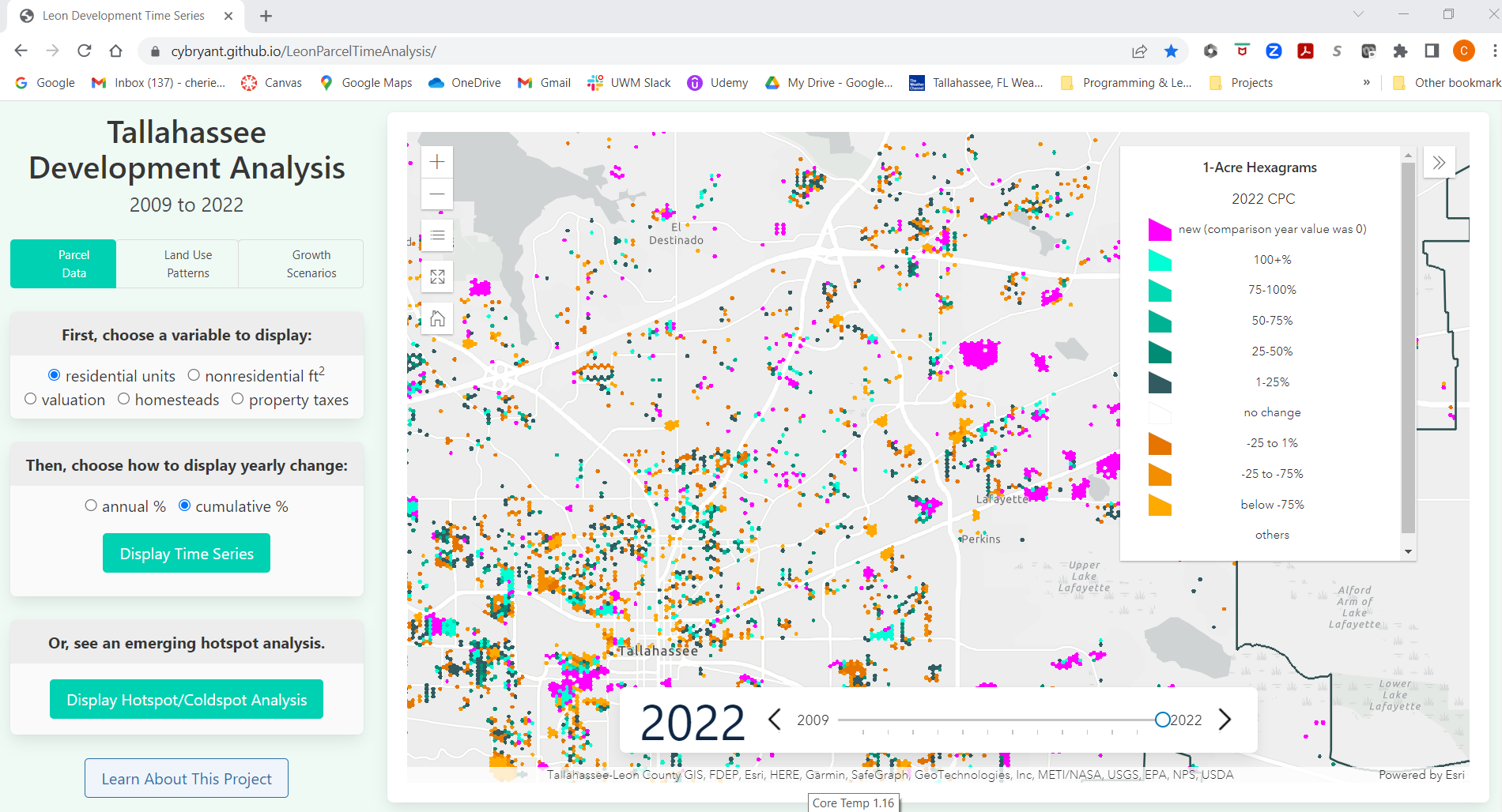
Cherie Bryant | Land Development Analysis Using Hexagram Bins for the Urban Service Area of Leon County, Florida from 2009 to 2022
Annual property appraiser parcel databases include a wealth of data that can be used to track development trends. However, parcel sizes and boundaries can change often and has historically made comparing databases from one year to another difficult. This project uses a custom python script to summarize 14 years of parcel data into 1-acre hexagram bins that remain constant from year to year. This allows trends in residential units, nonresidential square feet, valuation, homeownership, and property taxes to be calculated and visualized. The resulting feature class is then used to perform an emerging hotspot/coldspot analysis. The resulting feature classes are presented in a web application showing both annual change, cumulative change, and the hotspot analysis. The python script is structured to allow easy updates when parcel data is updated each October.
Technology Used: Python, ArcGIS Maps SDK for JavaScript
Links: https://cybryant.github.io/LeonParcelTimeAnalysis/
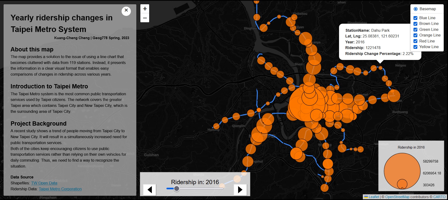
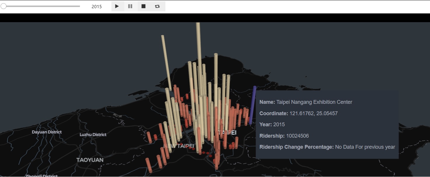
Kuang-Cheng Cheng | Yearly Ridership Data Visualization And Analysis For The Taipei Metro System In Taiwan.
This project aims to provide a new method for technical employees and city planners to observe changing ridership trends without having to perform complex statistical calculations. The project includes two products that serve different purposes. The Jupyter Notebook provides notes and workflows for technical users to follow, organizing and visualizing data simultaneously. On the other hand, the 2D web-based map offers a convenient way for non-technical users to easily navigate and gain insights into the trend and relevant background information without requiring many computer environment settings. The map not only simplifies the process of showing the trend lines in chart forms but also offers an intuitive way for users to observe the overall changes for the whole system directly by visualizing the data.
Technology Used: Leaflet, Python, PyDeck, Jupyter Notebook, JavaScript
Links: https://github.com/KCivilEnGI/GIS-Practicum
Alejandro Gomez | Los Angeles Tree Web Map
Trees are one of our most valuable resources. In addition to providing shade and beautifying streets, urban trees capture and clean stormwater runoff, remove pollution from the air, store carbon, and produce oxygen. The Los Angeles Tree Web Map is an online mapping application that allows users to explore the vast City of Los Angeles public park and public street right-of-way (ROW) tree inventory. Users can discover areas where trees are densely populated, search for their favorite tree(s) across the city, or visualize the range of tree heights along parks or streets. The application has a variety of features to explore trees across the city. The main feature is the ability to filter the two datasets by tree (common) name, street name, or park name. The application also provides the ability to change tree symbology, view tree characteristics, and change basemaps.
Technology Used: Esri Leaflet API, JQuery, Bootstrap, Javascript, HTML
Mingrui Huang | SAM 1960: Web Map of Air Defense Missile Sites in the United States, 1960
The SAM1960 website is an interactive tool that provides information on missile sites that were active in the United States during the 1960s. The website features an interactive map created using Leaflet.js and spatial data stored as GeoJSON files, which enables users to view missile sites near their community and additional information about each site. Additionally, the website has a notable sites page that provides information about missile sites available for public viewing. Using HTML, JavaScript, and CSS, the website is simple to use, mobile-friendly, and has a responsive design using the Bootstrap framework. Its static website architecture provides several benefits, including simplicity, easy maintenance, and easy updating and improvement over time. Overall, the SAM1960 website is a unique and informative tool for users to learn about the history of these missile sites and their significance.
Technology Used: HTML/JavaScript/CSS, Bootstrap, Leaflet.js
Links: https://jeffreyhuang.tk/SAM1960/SAM1960.html
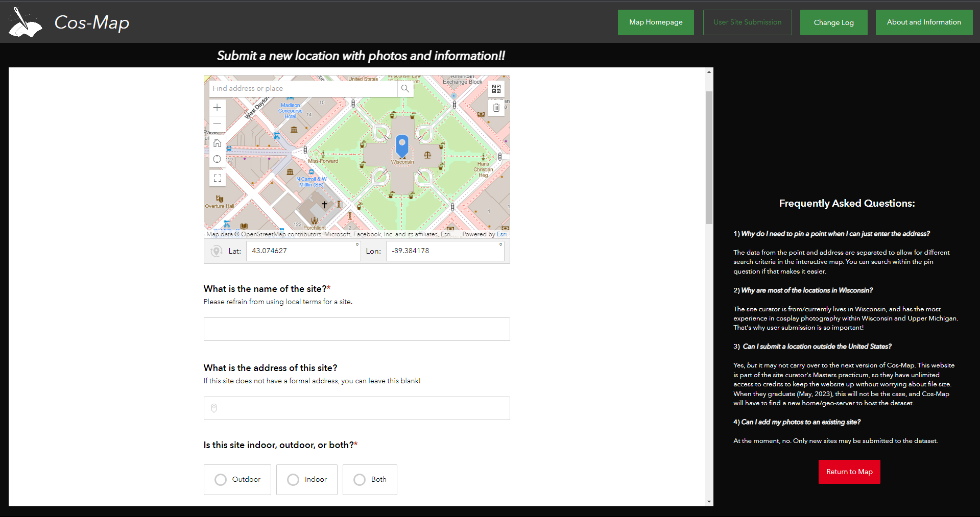
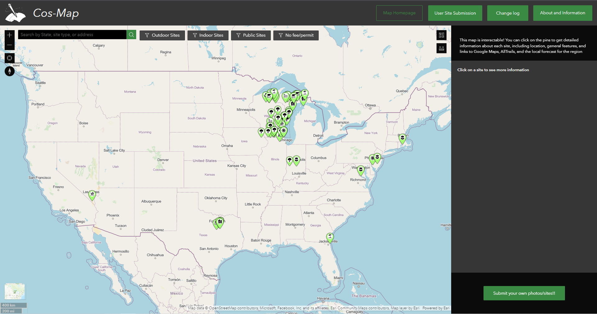
Mallory Johnson | Cos-Map
Cos-Map is an interactive map application tailored to the costume photography community, allowing photographers and cosplayers to find new photoshoot locations. The web application is built on ESRI’s Suite of applications, including ArcGIS Pro, Experience Builder, and Survey123. Search and filter widgets are built to allow a user to search by a location’s state, tag category (environmental feature), or by a location’s name. Users can submit their own locations and photos as attachments to the map, subject to automatic filtering and sentiment analysis, to share their experiences at different sites for others to review and use in future photoshoots. User submissions are the core of the application and continuing submissions continue to grow the database beyond administrative intervention.
Technology Used: ArcGIS Pro, ArcGIS Online, Microsoft Power Automate, ArcGIS Survey123
Links: https://experience.arcgis.com/experience/556b7aba7e984c94b7054c405d640635/
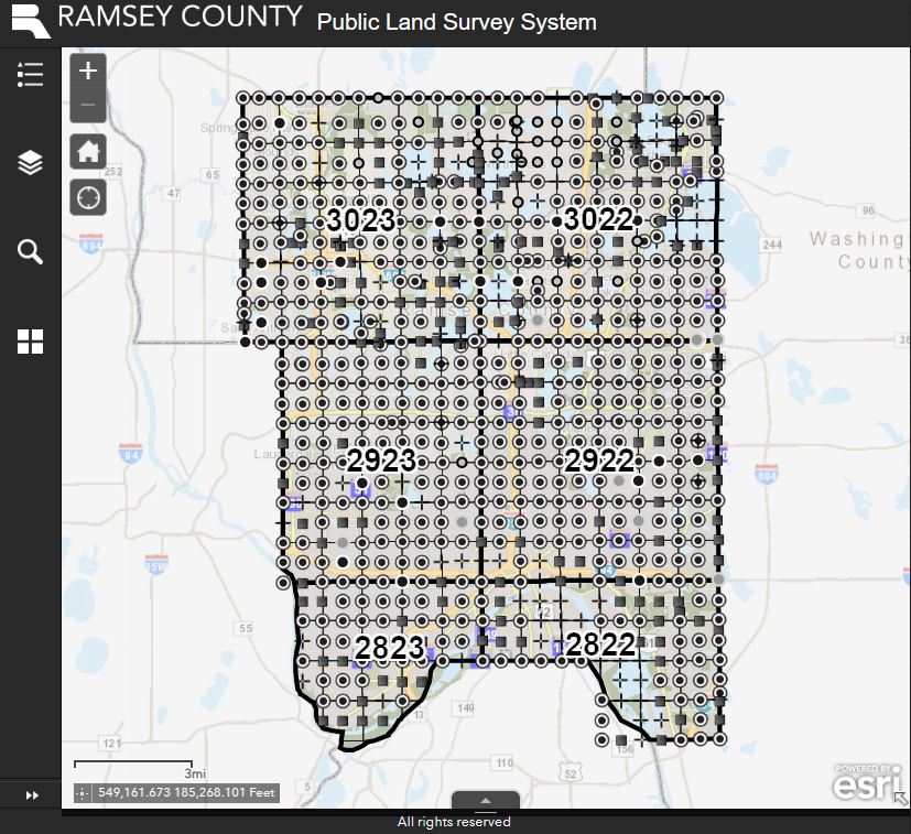
Jeff Kalar | Public Land Survey System Field Note Collector
The objective of my project is to streamline and improve upon the Ramsey County Surveyor’s Office current manual process of recording and storing field notes related to the Public Land Survey System (PLSS) within Ramsey County by allowing our land surveying technicians to utilize ArcGIS Field Maps to record, upload, and store these field notes. These field notes will be stored in a database and made available via an interactive web map for department use. ArcGIS Web AppBuilder was used to create the interactive web map and the database was developed using ArcGIS Pro then stored on ArcGIS Online. Forms to allow for field note collection were configured using ArcGIS Field Maps Designer.
Technology Used: ArcGIS Online, ArcGIS Pro, ArcGIS Web AppBuilder, ArcGIS Field Maps, Arcade
Links: https://uw-mad.maps.arcgis.com/apps/webappviewer/index.html?id=007f664d3fa84371b8336a5c2528ec0b
Jiaqi Guo (Max) | Canadian National Capital Region Flood Observation
The Canadian National Capital Region Flood Observation System is designed to help residents identify, report, and communicate flood related observed information with other product user groups.
The system consists of 3 major components, front-end webapp, hosting server and database. The front-end application is a mobile first web app developed with bootstrap framework and open layers API. Backend is using geoserver for data hosting and publishing. Database is using PostgreSQL database with PostGIS extension.There are a few simple geo-analytic tools from the front-end webapp, and user could conduct simple CRUD(create, read, update and delete) process to the observation service from the webapp through WFS service, which is hosted from the back-end server using the PostGIS database. There are also a separate page from the webapp to view flood related knowledge and news for the region. The entire stack’s deployed infrastructure is through Docker.
Technology Used: Openlayers, PostGIS, Geoserver, Docker, NGINX
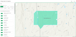
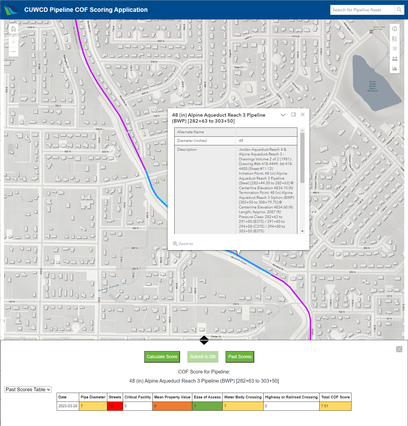
Aspen Neville | CUWCD Pipeline COF Scoring Application
To accomplish their mission of delivering water resources, Central Utah Water Conservancy District (CUWCD) needs to replace pipelines before they fail. When to replace pipelines can in part be determined by considering the consequence of failure (COF), or the potential impacts that would occur should the pipeline fail. COF is scored by evaluating the spatial relationships between a pipeline and surrounding features (e.g., distances to nearby roads). As such, I developed and designed the “CUWCD Pipeline COF Scoring Application”, an interactive web map application, to calculate COF scores for CUWCD pipelines using methods evaluating the spatial relationships between a selected pipeline and nearby features, write those scores to the PostgreSQL database through API calls, and view the scores in tables and charts for comparison to help determine pipeline replacement schedules.
Technology Used: ArcGIS Maps SDK for JavaScript 4.26, D3, jQuery UI, Bootstrap, ASP.NET Core
Nimita Shery | Public Dataset Finder
The Public Dataset Finder is a desktop web map application that serves as a tool to support renewable energy project development and helps users find public datasets by their location. It is mainly intended for GIS Specialists to use a single web map for gathering various national and state level public data required for preparing reports during the environmental permitting process during the preliminary stages of a project. The user will be able to select the location of the project site on the map which will query from the ArcGIS Online database and display and list them on the map. This enables the user to view more details and navigate to the website for downloading them. This application also aims to improve data management by making use of data APIs.
Technology Used: ArcGIS Maps SDK for JavaScript 4.26, ArcGIS Online
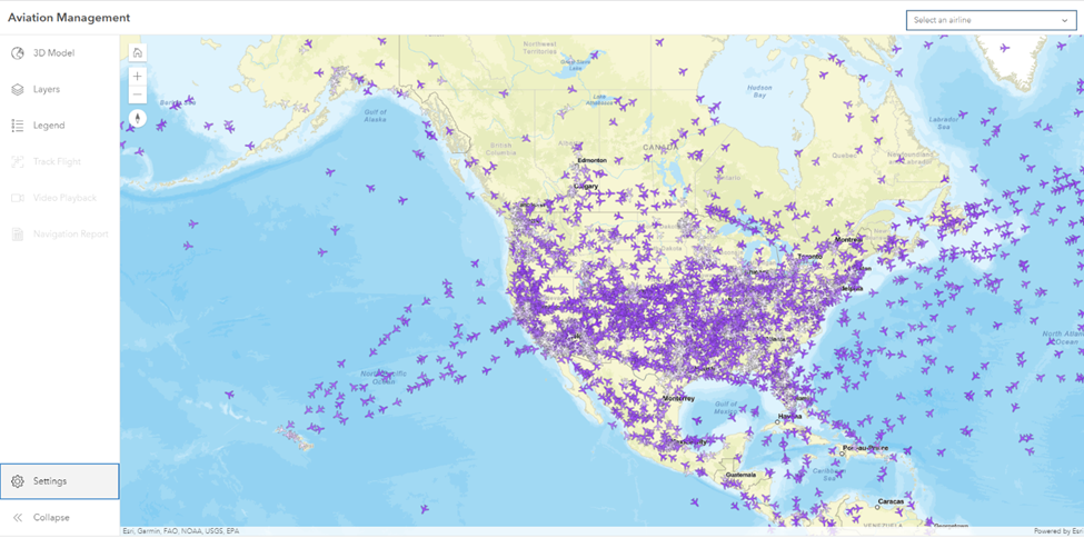
Andrew Winchell | Aviation Management
The Aviation Management web application is a user role focused application to monitor the conditions of the National Airspace and make real-time logistical decisions. Using the foundations of web programming in HTML, CSS, and JavaScript, the Aviation Management application builds a live feed connection between operating aircraft, US based airports, and US operating airlines. With the combination of these datasets, the user has the ability to monitor all incoming and outgoing flights of a user defined airport, or all en-route aircraft of a user defined airline to make decisions regarding flight delays, air traffic, and personnel requirements. This application serves will serve airport management, airline management, and aircraft spotters alike with its powerful data display and manipulation capabilities.
Technology Used: HTML, CSS, JS, ArcGIS JS API, Esri Calcite Design
Danielle Wyenberg | Garden Planner Web Map
The interactive garden planner web map is a tool to help gardeners gather information, design their garden plot, and receive feedback based on size of plot and vegetable choice. The web map is a valuable addition to the resources and information provided by the Iowa State Extension office. It helps to display data in a visual manner that is more accessible to many users, and to streamline the process of garden planning. Users can access information on hardiness zone, soil data, suggested vegetable varieties, and approximate expected yield. ArcGIS Pro was used to develop the feature layers and data format. The data is hosted using ArcGIS Online. ArcGIS API for JavaScript was utilized for web map design.
Technology Used: ArcGIS Pro, ArcGIS Online, ArcGIS API for JavaScript
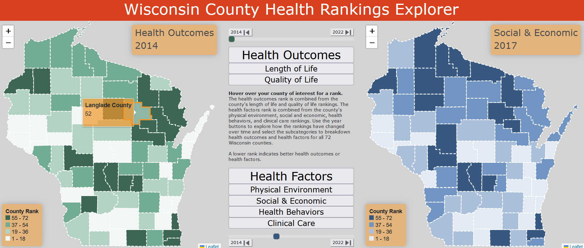
Nyla Thursday | Wisconsin County Health Rankings Explorer
The Wisconsin County Health Rankings Explorer is a web map application expanding a user’s ability to interact with and learn from an annual data release. There are two maps and an inner panel between them. The left-hand map has the health outcomes ranks and the right-hand map has the health factors ranks. In the middle panel the user can change the year from 2014 – 2022 using the year buttons and select different sub rankings using the buttons. The counties change color to indicate the ranking class and a pop-up will appear when you hover over the county for its associated rank.
I made the tool to expand the visibility of the robust data being collected and allow more individuals and organizations to benefit from county-wide health data. Knowing the health rankings of individual counties and their associated health metrics can be integral in decision making and funding potential.
Technology Used: Leaflet, jQuery, mapshaper, ArcGIS Pro
Links: https://nylathursday.github.io/778_project/
Fall 2022
This is an accordion element with a series of buttons that open and close related content panels.
Aileen Clarke | Traffic Fatalities in Washington, DC
This scrolling story explores traffic fatalities in Washington, DC from January 2021 to October 2022. Government agencies regularly provide data that is in the public interest for public use. However, there are often caveats to using this data. This project explored a traffic incident dataset provided by the DC city government. In the course of this project, I discovered how large a difference those caveats can make. As someone who is familiar with local DC news, I realized that the city dataset was missing some notable incidents, finding 19 incidents that caused 22 fatalities that were not included in the city’s dataset for the same time period. This story makes an argument for more radical shifts to keeping streets safe and for local community mapping that can more comprehensively serve community members.
Link: https://aileenclarke.github.io/dc-traffic-fatalities.html
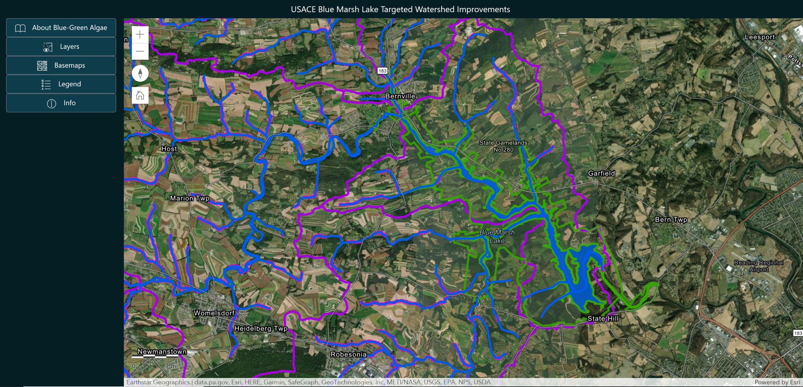
John DeLoretta | Watershed Study at Blue Marsh Lake for Blue-Green Algae Prevention
This project serves two purposes: to educate the public on blue-green algae, and also to help park rangers at USACE Blue Marsh Lake in Leesport, PA identify locations within contributing watersheds to install Best Management Practices (BMPs) in order to reduce excess nutrient runoff entering the waterways. This website is split into two pages to achieve each of those goals. The public can scroll through a narrative page to learn about formation, identification, health impacts, and current management practices of blue-green algae at the lake. The second page is an interactive web map that allows users to see topography, streams without vegetated buffers, soil erodibility rates, nitrogen and phosphorus loading rates, and also the estimated nutrient reduction per drainage basin of installing various BMPs of a location where they click.
Daniel Easter | Faster Feathering: Efficient & Simple Feathered Edges in ArcGIS Pro
When creating a map using GIS software cartographic design is often overlooked. Many GIS users have little if any training in cartography and they are often faced with time/budget restraints, which usually leads to poor map design. ArcGIS Pro has alleviated some of the recurring cartographic faux pas that were common in its predecessor, ArcGIS Desktop, by improving defaFaster Feathering: Efficient & Simple Feathered Edges in ArcGIS Proult layout settings and map symbology UX/UI. Still, many professional cartographers find that standalone graphic editing software, which is often inaccessible to the average GIS user, is critical to achieve a desired aesthetic.
Visual hierarchy is one of the most important tools cartographers can leverage when constructing a map. It allows the creator to emphasize certain features while de-emphasizing others. A feathered edge (also known as a vignette) around an area of interest (AOI) is one of the most effective ways to emphasize certain elements on a map by directing the user’s eye through masking and shadowing.
The tool that I created for this project creates a feathered edge effect by creating a simple raster that can be easily symbolized to the user’s preference. The tool is able to achieve these results quickly and at a low technical barrier to entry for the user, with the default settings be widely applicable. The tool leverages ModelBuilder to calculate an appropriately sized feathered edge raster based on the user’s input AOI.
Links: https://youtu.be/GOBi5MI-95U
Kray Freestone | Census Find
For my project, I created Census Find, a tool to let the technical-averse easily gain census insights. Getting the data you want from the U.S. census can be hard, and viewing it on a map can be even harder. This tool allows users to select the variables they are interested in, select the year they want, and apply it to any state, county, census tract, or place in the United States that they want. Say hello to reproducible insights across space and time.
Census Find is not currently live, but a demonstration on the functionality can be found on YouTube.
Links: https://youtu.be/Jf0zjedFfbA, https://github.com/freestok/census-find
Michael Hasinoff | Identification of Mapped, Yet No Longer Existing Unincorporated Communities (Phantoms) In Wisconsin
Upon close inspection of online maps, labels for non-existent unincorporated communities are common. These “Phantoms” are found because websites such as Google Maps use the US Geological Survey (USGS) topographic maps and its Geographical Names Information System (GNIS) as main sources of map data. Due to a paucity of resources, the USGS has not thoroughly rectified these inaccuracies and therefore, over time, Phantoms have persisted on their maps. Using residential parcel records from the Wisconsin Statewide Parcel Map, a methodology was developed in ArcGIS Pro that identified ~60 Phantoms from a list of ~625 unincorporated communities curated from the GNIS. With ground-truthing, most of these can be easily confirmed as Phantoms and subsequently presented to the USGS for appropriate re-symbolization or removal from US topographic maps. This approach can be viewed as a first step for updating maps of Wisconsin and the rest of the United States.
Jenna Johnson | Maryland Wildlife Explorer
The Maryland Wildlife Explorer is an interactive web map application that enables users to identify Maryland wildlife species and report their sightings on an interactive map. It serves like a digital field guide and includes identification information for reptiles, amphibians, birds, and mammals. The goal of Maryland Wildlife Explorer is to empower the next generation of environmentalists. An environmentalist is someone who cares about and advocates for the environment. The best way to become an advocate is to learn and understand the surrounding environment and all its wildlife. The application was designed to be kid friendly, utilizing Calcite and Bootstrap to create an appealing user interface. ArcGIS JS API was used to create the interactive map and the database was developed using ArcGIS Pro then stored on AGOL.
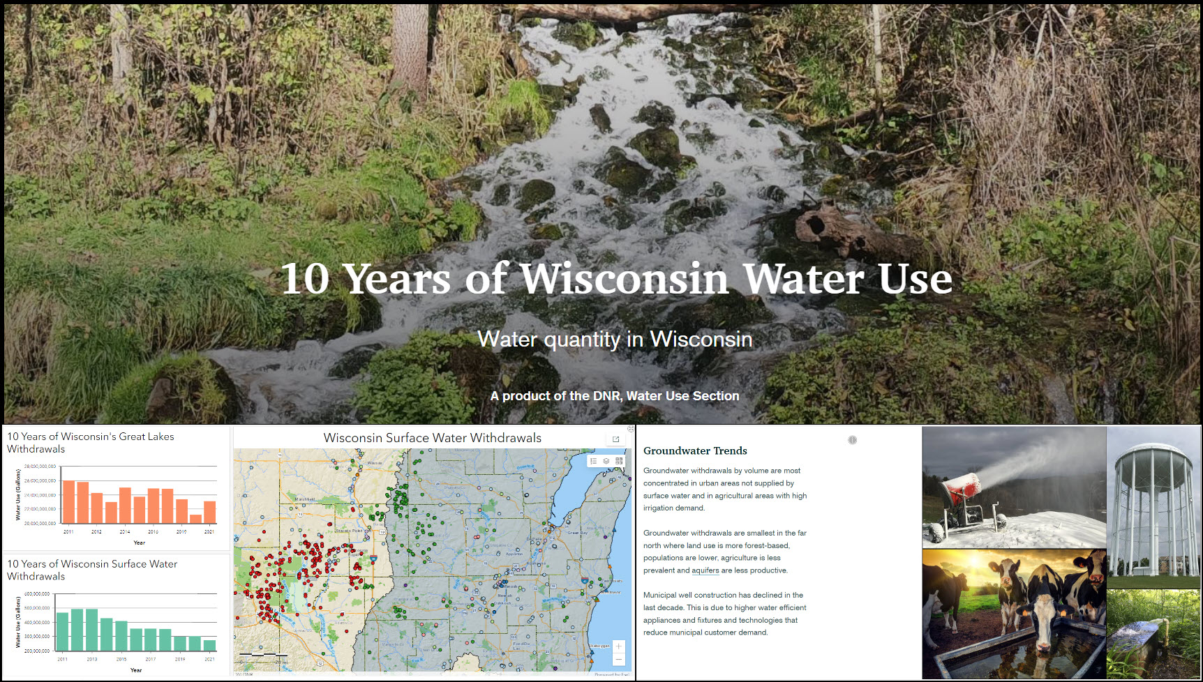
Joseph Rosnow | 10 Years of Wisconsin Water Use
The United States government passed legislation to implement the Great Lakes Compact in 2008. Wisconsin adopted this legislation 2 years later and has had an active management program through the Wisconsin Department of Natural Resources (WDNR). Included in this legislation are requirements for registering and reporting large groundwater and surface water withdrawals, as the Compact recognizes that good water resources data are necessary for water management, planning and protection. The WDNR Water Use Section has been collecting and managing the full data set for the past 10 years.
The purpose of my ARC GIS Online Storymap project to communicate water use concepts, visualize spatial patterns and show statistical trends from the 10 years of water use data in Wisconsin. Look for this Storymap to be released publicly in March of 2023.
Eli Samuelson | St. Louis Metro Bus Redesign
The objective of this project was to redesign the public bus transportation system of St. Louis. By using current St. Louis Metro bus routes, population statistics, and human points of interest (businesses, public buildings, etc.), I worked to create a new and updated bus system that would better fit the city’s needs. Using GIS and Statistical software (ArcGIS, Python, Excel), I created maps that contained comparative statistics between the new and old systems to explain the updates for the public. Additionally, I created a full visual map of the updated system to provide frequency information, line name information, and some geographical locations the rider can use to better understand when and where the buses would be running with the update.
Link: https://sites.google.com/view/eli-samuelson/st-louis-metro-bus-redesign
Alissa V Stark | Development of a Google Earth Engine Application Example Using Remote Sensing for Change Detection and Trend Analysis
This project synthesized the numerous examples and supporting documentation available regarding accessing and analyzing the data collections within Google Earth Engine for two end goals.
First, create an application that is an example of how a research project benefits from an interactive and approachable end product for users of varying technical abilities; this makes the science available to more users.
Second, create the code in a way that it exists an in-depth example of the pieces necessary to answer the questions that come up when trying to detect change within Earth observation datasets; this makes the code accessible to additional developers or scientists that have limited experience with coding or GIS.
Link: https://avstark.users.earthengine.app/view/growing-season-change-detection
Summer 2022
This is an accordion element with a series of buttons that open and close related content panels.
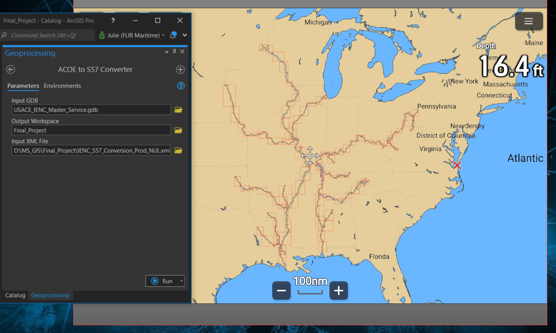
Julie Boyden | Application to Convert Army Core of Engineers’ Electronic Chart Database into S57-Format
This ArcPy tool solves a problem I come across regularly in my current job at Raymarine, getting data into the correct format to create a chart. This application converts our customer’s, Army Core of Engineers, inland data written in IENC (Inland Electronic Navigational Chart) format to S-57 format. This format is needed for my group to create the chart that will be used for navigational purposes on Raymarine devices. I am provided a geodatabase with one hundred layers containing depth information, danger points, buoys, etc. with fields and attributes that all need the proper naming conventions for the chart to symbolize correctly. All conversions are done through Python/ArcPy scripting and run by an ArcPy tool.
Tools: Python, ArcPy, Arc Pro
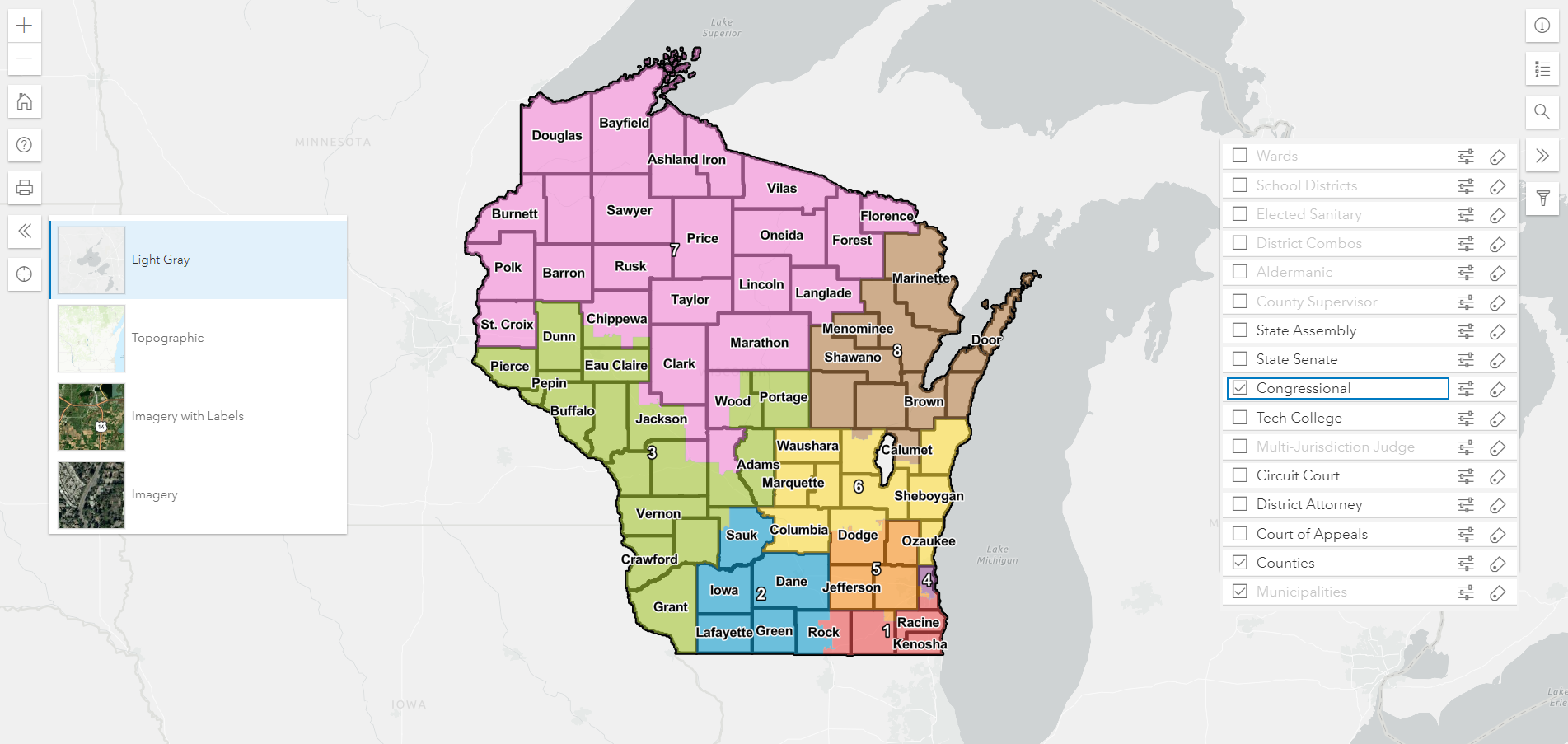
Greg Grube | Wisconsin Voting Districts
The Wisconsin Elections Commission’s job is to help manage election systems in the state of Wisconsin to benefit both members of the public looking to register and vote, but also to help the 1,850 election clerks around the state run elections and manage elections data.
Every 10 years, redistricting occurs in the State of Wisconsin after the U.S. Census. Federal, state and local election districts may be changed as a result. The purpose of this project is to create an interactive web map that can be used by municipal and county clerks to visualize new and existing districts in an intuitive way. It allows for customization, searching and filtering to suit the needs of their county or municipality. Though primarily designed for clerks and election staff, the map can hopefully be beneficial to anyone interested in election geography in Wisconsin.
Tools: ESRI ArcGIS Javascript API 4.23, ESRI ArcGIS Online storage
Project Links: https://grubeg.github.io/WisconsinVotingDistricts/
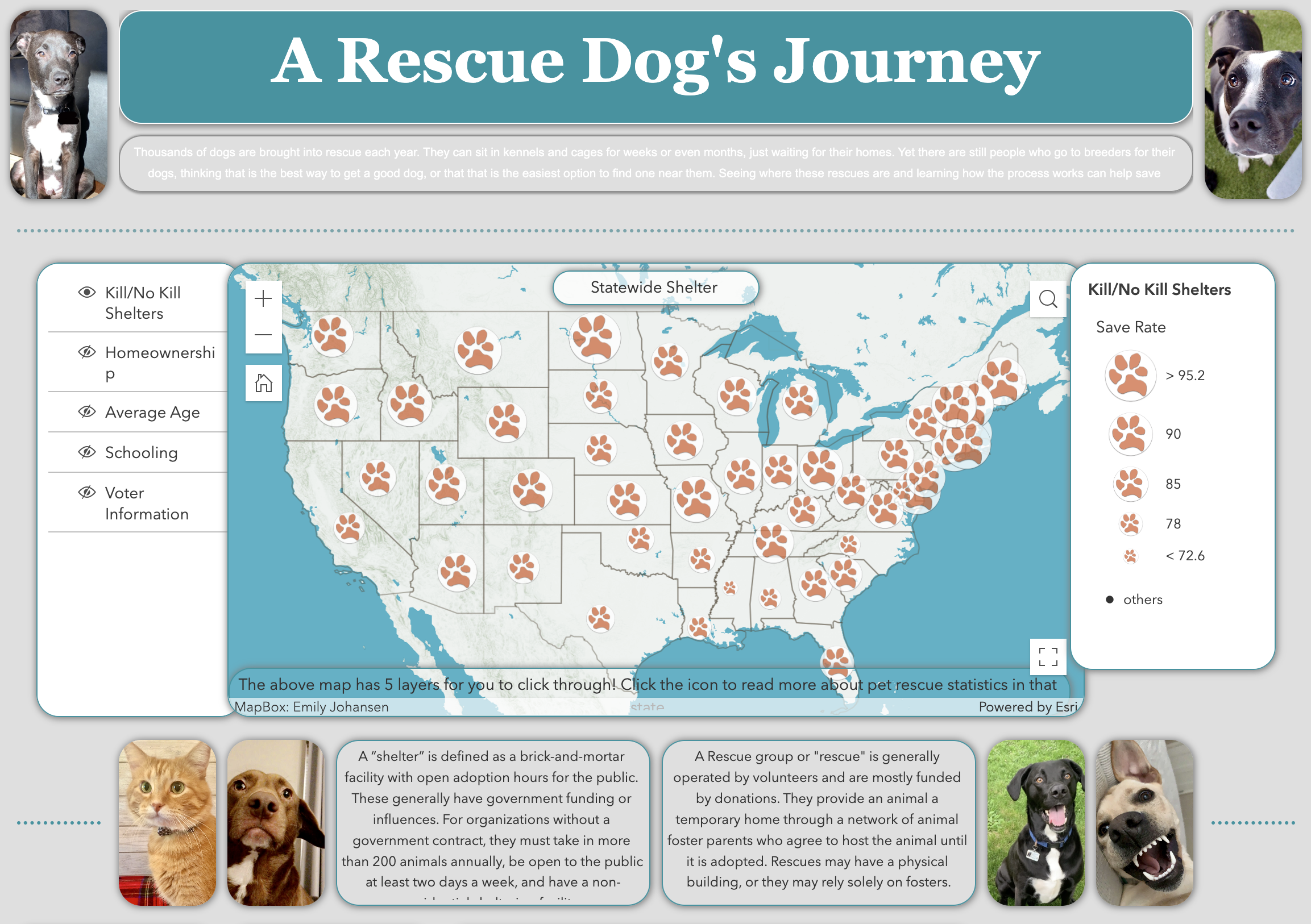
Emily Johansen | A Rescue Dog's Journey
I created a website called A Rescue Dog’s Journey to teach people about animal rescues and shelters near them. Any person could go onto this website and learn about state or Wisconsin county totals. The goal is to teach people about the ease and availability of going through rescues/shelters rather than feeling the need to find a breeder. They could learn about save rates and the correlation coefficient that average age, homeownership, or level of education have on the save rate of animals in their state or county. There is also a map specifically about rescues in Wisconsin. One could learn everything they could want to know about which rescues are near them and how to get in contact or learn more!
Tools: ArcGIS Online, MapBox, HTML, Correlation Coefficient Formulas,
Project Links: https://experience.arcgis.com/experience/b3cc2b146b5b4ab2ae4f2baf086cd999
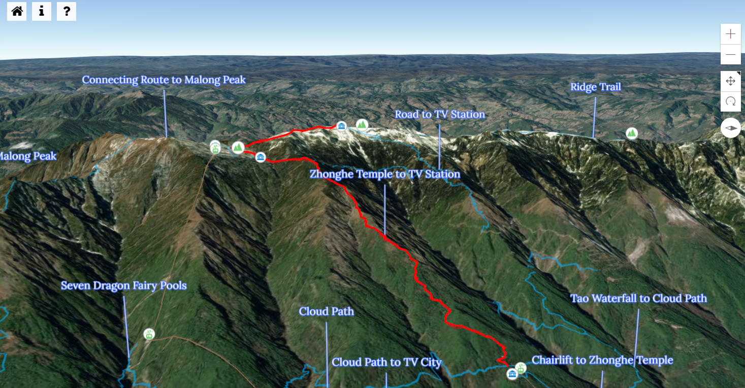
Bryce Linden | Cangshan Geopark Map
Dali-Cangshan UNESCO Global Geopark is a park located in rural southwestern China and celebrated for its rich geological history. This project seeks to improve hikers’ understanding of these geological artifacts by creating a user-friendly, interactive three-dimensional map that displays the hiking network of this park as well as the location of significant geological features. Its interactivity gives users the option to view trails and features from any angle, thus deepening their understanding of the region while reducing negligence. By modifying an existing mapping project designed by Esri through ArcGIS API, this project uses existing tools and tailors them to further the park’s goal of spreading geological knowledge.
Tools: ArcGIS API, NPM, JavaScript, Sass