In a world dotted with mountains of geospatial data, Dr. Jonathan Nelson advocates for maps users can understand.
by Isabella Ruder | May 11, 2023
Originally posted to UW-Madison College of Letters & Science News
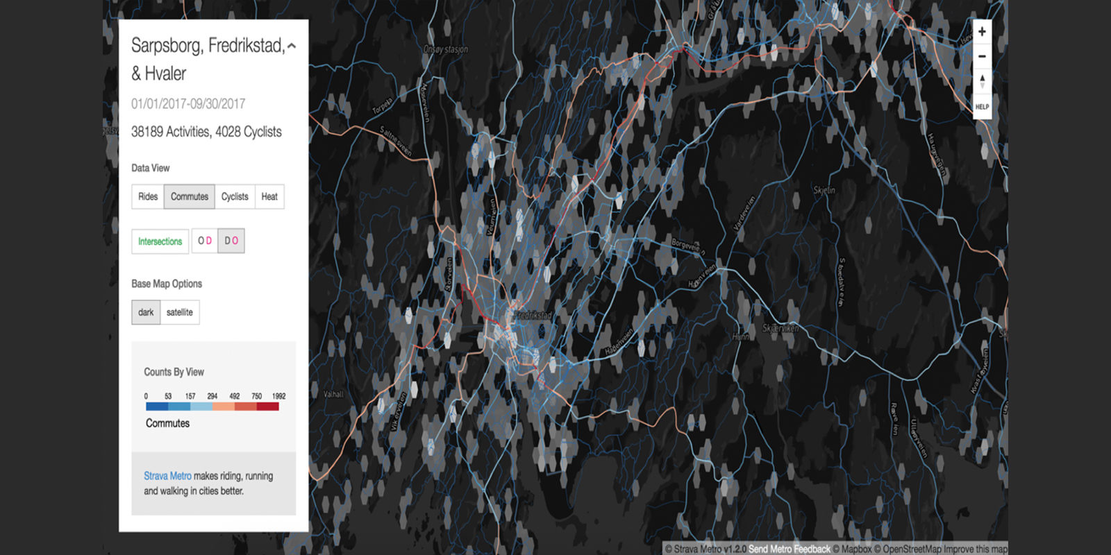
Screen shot of an interactive map showing commuter trips and bicyclists in a metropolitan European city.
Whether we realize it or not, geospatial data touches our lives in countless ways each day — when we use our smartphones to find the closest coffee shop, or when we ride our bikes in lanes that city planners designed using geospatial data. Dr. Jonathan Nelson, an assistant professor of geographic information science and technology (GIS&T), looks to organize and present this data by creating maps that are user-friendly and easy to understand.

Dr. Jonathan Nelson
Nelson recently joined the Department of Geography as the Associate Director of GIS Professional Programs. His research involves the use of geospatial data, which includes any piece of data with a place-based characteristic — things like latitude, longitude and elevation.
One of Nelson’s collaborative projects, the Neotoma Project, combines datasets for educators, students and researchers in paleo science, the historical study of climate and environment. Mountains of data collected by climate scientists might make sense to climate experts, who can use them to predict future climate conditions, but to other groups, from environmentalists to legislators and the public, they’re far more likely to be dense and inaccessible.
Effectively communicating this data could alter the public’s perception and understanding of climate change. If citizens could easily interpret the data, they might be more inclined to take action to address climate change.
But creating maps using geospatial data can be challenging. Constructing an easily understood map risks oversimplifying the data. Then there are questions about map usability and utility: Can users perform the necessary tasks effectively and efficiently? Is the map useful and beneficial to the audience?
Collaboration can solve some of these problems. Nelson believes that map creators should put themselves in the shoes of the users to understand their needs. It’s a strategy he teaches to the students in his classroom and implements in his work.
“You would iteratively include them [the audience] in the whole design and implementation phase,” says Nelson. “Typically, when you do that, there aren’t too many surprises at the end, and they’ve essentially directed the design of what they’re going to use.”
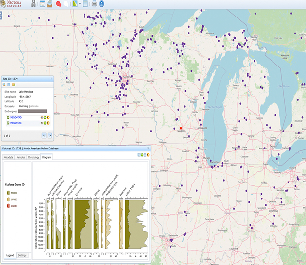
A map showing plant pollen levels across the Midwest can show scientists how environmental processes affect vegetation patterns.
Some of Nelson’s other map projects have a much more straightforward and general purpose. Scientists analyze pollen to see how plant life patterns change over time. Data from across the Midwest and Northeast regions was collected and made into a user-friendly map. This shows scientists how environmental processes impact vegetation patterns. Map resources like this can be game changers for scientists in terms of data accessibility.
Another Nelson-created interactive map shows the volume of cycling trips, commuter trips and bicyclists in a variety of metropolitan areas and was created to help city planners. It answers key questions: Which paths are being used most frequently by commuters? Where can planners improve infrastructure to make commuting and cycling in the city safer and more efficient?
Nelson’s diverse work background includes experience from industry, government and academia. He combines all three into his GIS work. His research on accessible geospatial information now focuses on mentoring students in the classroom — it’s what drives Nelson’s passion for teaching.
“One of my favorite parts of the job is mentoring students,” he says. “There’s nothing quite like hearing them pitch all these crazy ideas at the beginning of the project and then watching them refine them over the course of the term. And then to see what they’ve built by the end is rewarding.”
Meanwhile, Nelson continues to focus on designing and using maps and charts to help enrich people’s lives. Large amounts of personal data are collected every day from now-common devices like Apple Watches and Fitbits. Being able to interpret the data they’re generating through their own physical actions lets people learn more about their daily lives and habits in combination with environmental and other place-based factors. When trying to live a healthier lifestyle, someone may look at the number of steps they take in a day. If it is below 10,000 steps, a simple solution would be to walk to more places. Users can create solutions to problems based on their own personal data.

Visualizing the link between a pet’s exercise habits and health can help dog owners take better care of their pets.
This can apply to pets, too. Data about a pet’s nutrition and exercise habits can improve their lives and pinpoint areas of improvement for owners. A chart Nelson recently created displays a dog’s movement patterns and caloric ratio, represented by easy-to-grasp boxes and colors. (Green equals healthy, while red equals less healthy.) Using the visuals as a guide, pet owners can go on more walks and monitor their pet’s health, potentially adding more years with their best friend.
“We make maps more relatable to ourselves. We see ourselves not just in our own data but in our own user experiences,” says Nelson.